
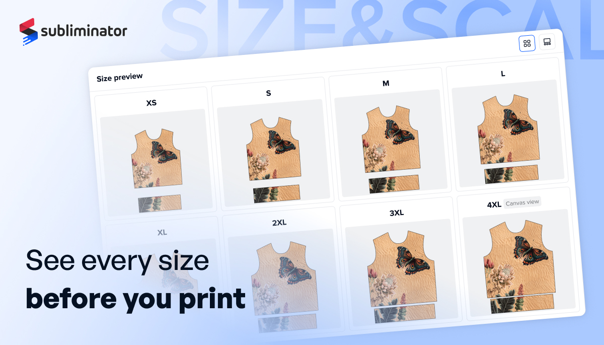
Size Preview shows how your design actually sits on every available size of a product, before you publish. Until now you had to guess, because mockups only show a couple of sizes. Size Preview removes the guesswork: one screen, every size, your real design. You'll find it in Step 1 (Design) in the Creator.
Every garment size has its own print area. When a design is shrunk to fit a smaller size, two things can go wrong: placement drifts (a left-chest logo can slide toward the centre or collar), and edges get cut (a large all-over design scaled down as one flat image can crop at the edges). Size Preview lets you see and fix this up front.
Open a product in the Creator, go to Step 1 (Design), and open Size Preview from the sidebar. You'll see a card for each available size showing your current design in that size's print area. Note: Size Preview only appears for products with more than one size.
One card is marked Canvas size, the largest size and the one you actually design on. Every other size is generated from it, so it's your reference point.
Your canvas is the largest size available (on the Fashion Hoodie, that's 4XL). When you save, the factory generates a separate print file for every size from that one canvas. Garment sizes don't shrink evenly: as sizes go down, pattern pieces get narrower at the sides faster than they get shorter. This is called grading, and it's how clothing is made everywhere. It means anything placed near the side seams can move past the cut line on smaller sizes. The Scaling method setting puts that decision in your hands, per layer.
One rule applies to both, and it's the most common misunderstanding: in both methods your artwork gets smaller as the garment gets smaller. Size is never the difference; the only difference is how each layer is positioned on smaller sizes. You choose the method in Layer Settings, and Size Preview updates instantly so you can compare.
The layer is positioned separately for every size, relative to that size's own print area. A logo stays the same relative distance from the seam on every size. It's always fully visible and nothing is trimmed; spacing between layers can shift slightly between sizes. Best for logos, text, numbers, badges, and anything near a seam or edge.
All layers are treated as one image and scaled down as a whole for each size. The layout stays identical on every size, but parts near the side seams fall outside the cut line on smaller sizes and are trimmed (intentional bleed for backgrounds). Best for background images, full-bleed artwork, repeating patterns, and artwork where elements must stay aligned to each other.
Neither method is better; they solve different jobs, and most designs use both: a background on Scale with design, and logos or text on Adapt to each size.
Ask one question per layer: what matters more, staying visible or staying in place? Backgrounds and edge-to-edge artwork: Scale with design (trimming at seams is intentional bleed). Logos, text, numbers, badges: Adapt to each size (never cut off). A small element centred on the chest: either works, keep the default. Connected illustrations that must stay aligned: Scale with design, and keep the important parts inside the safe print area.
We recommend a quick Size Preview pass on every design before publishing, especially when a layer sits close to a seam. For Adapt to each size layers, confirm spacing still looks good on the smallest sizes. For Scale with design layers, confirm nothing important is trimmed at the seams: background bleed is fine, a logo crossing the seam is not.
Nothing is deleted from your file. The full image is printed on the fabric; the panel is then cut along the cut line and sewn, and artwork past the cut line is trimmed away with the excess. In manufacturing this overflow is called bleed and it's standard in all cut-and-sew production. For backgrounds it's exactly what you want, guaranteeing the print reaches into the seams with no gaps. The safe print area (the red dashed line on your canvas) is a related but separate guide: keep critical elements inside it on the canvas size, then let the scaling method handle the other sizes.
Adapt to each size, they must stay fully visible on every size. That's why it's the default.
Scale with design, backgrounds are meant to run past the cut line on smaller sizes. That trimmed overflow is intentional bleed.
That layer is on Scale with design and sits close to a seam. Switch it to Adapt to each size, or move the element inside the safe print area, and check in Size Preview.
No. In both methods artwork scales down with the garment, keeping the same visual proportion. The methods differ only in positioning.
Yes, and it's recommended: Scale with design for the background, Adapt to each size for logos and text.
They keep their original behaviour (Scale with design), so existing products and reorders don't change. New layers default to Adapt to each size, and you can change any layer anytime.

E-commerce enthusiast & founder @ Subliminator.

